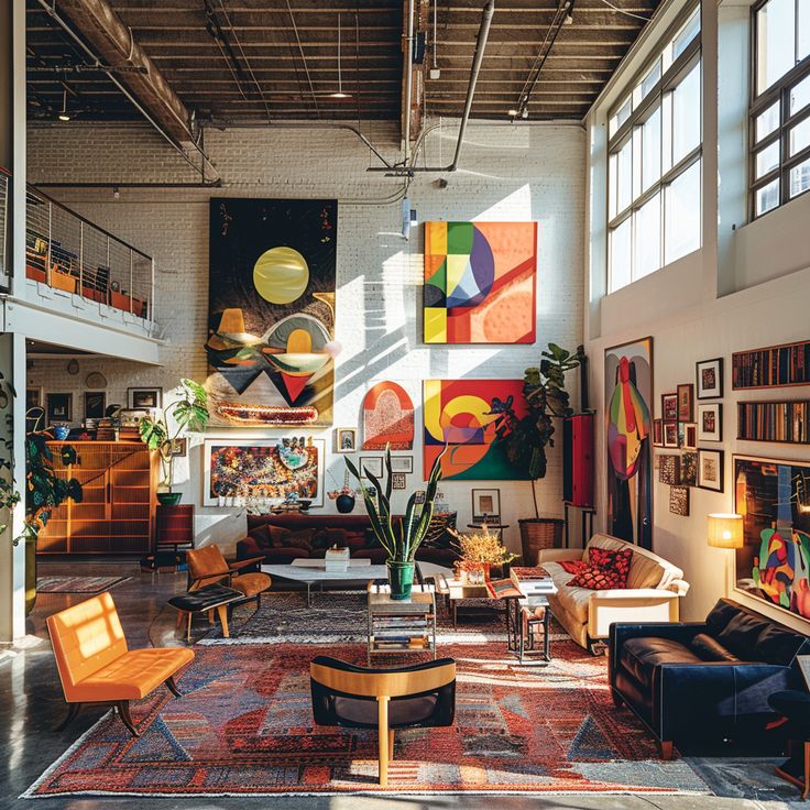
The color scheme of a home is one of the most impactful decisions in interior design. It sets the mood, influences our emotions, and ties a space together. While a homeowner might be drawn to a specific color, a professional interior designer approaches color selection as a strategic art form. They go beyond personal preference, using a thoughtful and systematic process to create palettes that are cohesive, harmonious, and perfectly suited to the home and the people who live in it.
Contents
ToggleHere’s a look at the key principles Interior designers in chennai use to select color schemes that work.
1. Understanding the Psychology of Color
A designer’s first step is to consider the intended mood and function of a room. They know that colors have a profound psychological effect on us.
- For Calm and Serenity: In bedrooms and bathrooms, designers often lean on cool colors like blues and greens. These hues are known to be calming and can help create a serene, spa-like atmosphere.
- For Energy and Socializing: In dining rooms or living areas, warm colors such as reds, oranges, and yellows can be used. These colors are energetic and inviting, encouraging conversation and warmth.
- For Versatility and Balance: Neutral colors—whites, grays, and beiges—are the foundation of many timeless designs. They provide a calm backdrop that allows other colors and textures to shine without overwhelming the space.
2. The 60-30-10 Rule: A Proven Formula
To create a balanced and professional-looking color scheme, designers often follow the classic 60-30-10 rule. This simple principle ensures that no single color dominates and the overall look feels intentional.
- 60% Dominant Color: This is the main color of the room, typically used for the walls and large anchor pieces of furniture like the sofa.
- 30% Secondary Color: This is a complementary color used for drapes, accent chairs, or a rug. It provides a contrast to the dominant color and adds visual interest.
- 10% Accent Color: This is a pop of a bold or vibrant color used sparingly on accessories like throw pillows, art, or vases. It’s the finishing touch that adds personality and flair.
3. Considering Existing Elements and Natural Light ☀️
A designer never works in a vacuum. They build a color scheme around the elements that are already present in a home.
- Fixed Elements: The color of the flooring, the tone of a fireplace, or the wood of kitchen cabinetry all provide a starting point. A designer selects colors that will complement these permanent features rather than clash with them.
- The Power of Light: The amount and type of natural light a room receives heavily influences how a color appears. A designer knows that a color can look completely different in a north-facing room (which receives cool light) versus a south-facing room (which receives warm light). They will test swatches on the walls at different times of day to ensure the final choice is perfect.
4. The Importance of Texture and Undertones
A designer’s work with color is not just about the hue; it’s also about the subtle details that add depth and richness.
- Layering Texture: Even a monochromatic room can be visually stunning through the use of different textures. A designer might combine a smooth, matte wall with a textured bouclé armchair and a soft knit blanket to create interest and a tactile experience.
- Recognizing Undertones: Every color has an undertone—either warm (yellow, red) or cool (blue, green). A designer is an expert at identifying these undertones and ensures that all the colors and materials in a room have a similar undertone to create a harmonious and cohesive feel.
In summary, a designer’s process for selecting a color scheme is a thoughtful and strategic one. By considering psychology, using proven rules, and paying attention to subtle details, they create spaces that are not only beautiful but also perfectly balanced and tailored to enhance the homeowner’s lifestyle.

